Crypto investors have access to more information than ever before.
A single research setup can combine blockchain explorers, wallet labels, smart money dashboards, protocol revenue, stablecoin flows, TVL, exchange balances, token unlocks, liquidity depth, derivatives positioning, portfolio exposure, and real-time alerts.
In theory, better access to data should produce better decisions.
In practice, it often creates a different problem: investors become faster at collecting information without becoming better at interpreting it.
A dashboard can show that exchange inflows are rising, but it cannot automatically tell you whether those coins will be sold. A wallet label can identify a historically profitable address, but it cannot guarantee that its next position will succeed. A protocol can show growing TVL while relying heavily on incentives, rising asset prices, or unstable capital.
The gap between data access and decision quality is where many crypto research tools mistakes begin.
The best investors are not necessarily the people with the most subscriptions or the most complex screens. They are often the people who know what question they are trying to answer, understand the limitations of each metric, and have a process for separating evidence from interpretation.
Better tools can improve research.
They cannot replace judgment.
The False Promise of the Perfect Crypto Dashboard
Crypto analytics platforms solve a real problem. Public blockchain data is large, fragmented, and difficult to interpret manually, so tools help organize it into queries, charts, labels, comparisons, and alerts.
Dune’s official documentation describes tools for querying, visualizing, and sharing blockchain data. DeFiLlama’s methodology focuses on aggregating and standardizing DeFi statistics, while platforms such as Nansen add wallet labels and behavioral context to raw addresses.
These capabilities are valuable, but the existence of a better interface does not make the underlying analysis automatic.
Consider a dashboard showing:
- Rising active addresses.
- Growing TVL.
- Positive stablecoin inflows.
- Increasing DEX volume.
- Whale accumulation.
- Higher protocol revenue.
At first glance, the combination appears strongly bullish. Yet every metric introduces another question.
Are the active addresses returning users or incentive farmers? Is TVL increasing because of new deposits or asset appreciation? Are stablecoin inflows entering productive markets or sitting in a few wallets? Is DEX volume organic? Does “whale accumulation” represent directional conviction, market making, treasury activity, or wallet restructuring?
The dashboard organizes the evidence.
The investor still has to interpret it.
That distinction is central to understanding why better tools do not automatically make better crypto investors.
1. More Data Can Create More Noise, Not More Clarity
The first of the major crypto research tools mistakes is assuming that more information always improves a decision.
Research on information overload has challenged that assumption for years. An NBER paper on attention manipulation and information overload argues that limited attention can make additional information counterproductive when competing sources overwhelm the ability to process what matters.
Crypto is almost designed to create this problem.
An investor researching one ecosystem might simultaneously monitor:
- Token price.
- TVL.
- Stablecoin supply.
- Active users.
- Transactions.
- Fees.
- Revenue.
- DEX volume.
- Whale activity.
- Developer activity.
- Social sentiment.
- Funding rates.
- Open interest.
- Token unlocks.
Each metric may be useful, but usefulness depends on the research question.
If the question is whether a DeFi protocol’s yield is sustainable, social sentiment may be secondary. Revenue source, incentives, liquidity depth, withdrawal conditions, token emissions, and protocol risk are much more relevant.
If the question is whether an ecosystem is gaining durable users, a whale transaction may matter far less than retention, application diversity, stablecoin depth, and fee-generating activity.
More data improves research only when the investor knows what to exclude.
A strong process narrows the information set before opening more dashboards.
2. Better Tools Can Strengthen Confirmation Bias
One of the most dangerous crypto research tools mistakes is using sophisticated data to defend a conclusion that was already made emotionally.
An investor buys a token and then starts researching it.
That order matters.
Once exposure exists, the research process can quietly change from: “Is this investment thesis correct?” to: “Which data supports my investment thesis?”
The difference may seem small, but it changes how information is selected.
An investor who is bullish may focus on rising active addresses while dismissing falling retention. Another may celebrate TVL growth while ignoring that incentives are increasing faster than organic fees. A whale accumulation dashboard may receive attention, while large exchange deposits from other wallets are dismissed as irrelevant.
The tools have not failed.
They are being used selectively.
A large meta-analysis published through the American Psychological Association examined selective exposure to information and found evidence that people often prefer information consistent with their existing attitudes, although motivation for accuracy can reduce that tendency.
Crypto markets make this especially difficult because investors can almost always find a metric supporting either side of an argument.
The answer is not to stop using data. It is to create a process that actively searches for disconfirming evidence.
BlockCodex explores the behavioral side of this problem in Crypto Investor Psychology: 7 Behavioral Traps That Shape Market Cycles.
A useful research habit is to maintain two separate sections in every investment note:
Evidence supporting the thesis
and
Evidence that could invalidate the thesis
A tool becomes more useful when it is used to challenge a belief, not merely decorate it.
3. A Precise Metric Can Still Produce a Wrong Conclusion
The third mistake is confusing measurement precision with interpretation accuracy.
Blockchain data often feels objective because transactions are public and verifiable. A token moved from one address to another at a specific block height and timestamp. That fact is clear.
The interpretation is less clear.
Suppose a large wallet sends BTC to an exchange.
The observation is precise:
A large amount of BTC moved from a private address to an exchange-associated address.
The interpretation might be:
The whale is preparing to sell.
That interpretation may be reasonable, but it is not proven by the transaction alone. The movement could relate to custody restructuring, collateral management, internal operations, market making, OTC settlement, or an actual sale.
The same problem appears across on-chain analysis.
Rising active addresses can reflect adoption, but also bots or incentive campaigns. TVL growth can indicate capital inflows, but also token appreciation. Stablecoin inflows can provide potential buying liquidity, but can also support market making, lending, payments, or defensive positioning.
This is why BlockCodex’s guide on Why Most Investors Misread On-Chain Data focuses on the difference between visibility and understanding.
Analytics platforms reduce the cost of seeing what happened.
They do not eliminate the need to ask why it happened.
4. Attractive Dashboards Can Make Weak Metrics Feel Important
Good visualization is powerful.
It helps investors recognize trends, compare time periods, detect anomalies, and organize complex datasets. Dune, for example, provides infrastructure for querying blockchain data and building visualizations and dashboards across on-chain datasets.
The danger appears when the visual presentation becomes more persuasive than the analytical value of the metric itself.
A clean upward chart feels meaningful.
But before interpreting it, investors should ask:
- What exactly is being measured?
- How is the metric calculated?
- What period is being compared?
- Can one entity generate multiple observations?
- Is the value denominated in dollars or native assets?
- Are incentives influencing behavior?
- Does another independent metric confirm the trend?
Definitions matter.
For example, DeFiLlama’s data definitions specify what its TVL metric includes and how chain-level TVL is constructed. An investor comparing figures across platforms should understand that different methodologies can produce different results.
The visual quality of a dashboard does not solve methodology problems.
A simple table with a clear definition can be more useful than an impressive chart built on a misunderstood metric.
5. Wallet Labels Can Become Narratives Instead of Context
Wallet intelligence tools can add a valuable layer to crypto research.
Raw blockchain explorers show addresses. Analytics platforms can add labels that help distinguish exchanges, protocols, funds, whales, market participants, and other entities.
That context can save significant research time.
The mistake is turning a label into a prediction.
Suppose a dashboard identifies a wallet as “Smart Money” and shows that it bought a token. The useful observation is that an address with certain historical characteristics increased exposure.
The dangerous conclusion is:
“Smart money bought, therefore I should buy.”
Even Nansen’s own educational material notes that wallet labels and classifications require interpretation and ongoing validation rather than being treated as infallible signals.
Historical profitability does not guarantee future profitability. A wallet may also be hedged elsewhere, managing several strategies simultaneously, providing liquidity, or operating with a time horizon completely different from yours.
Wallet intelligence should help answer:
“Who may be behind this activity, and how does that change the context?”
It should not replace the investment thesis.
This is a good example of how powerful crypto research tools can create weak decisions when the user outsources interpretation to the interface.
6. Real-Time Alerts Can Turn Research Into Reaction
Alerts appear useful because they reduce the chance of missing an event.
An investor can monitor whale transfers, exchange inflows, token unlocks, large swaps, stablecoin movements, liquidity changes, and protocol activity. For risk management, some alerts genuinely matter.
The problem begins when every event becomes urgent.
A large exchange deposit triggers concern. A whale purchase creates FOMO. A sudden TVL decline creates fear. A stablecoin inflow creates an immediate bullish narrative.
The investor is no longer researching.
The investor is reacting.
This becomes particularly dangerous in a 24/7 market where new information never stops. Constant alerts can shorten the decision horizon, encourage overtrading, and give recent events disproportionate importance.
The question before creating an alert should be: What decision will I reconsider if this condition occurs?
For example:
If stablecoin liquidity falls by 20% while DEX depth and protocol TVL also decline, I will reassess the ecosystem thesis.
That is a useful monitoring rule because several related signals are connected to a predefined decision.
By contrast:
Alert me whenever a whale moves more than $1 million.
This may create large amounts of information without a defined analytical purpose.
Good monitoring is selective.
The objective is not to know everything immediately. It is to identify changes that can alter the thesis.
7. Tool Stacking Can Fragment the Research Process
The final major crypto research tools mistake is believing that adding another platform automatically fills a research gap.
An investor may use one tool for market data, another for TVL, another for protocol revenue, another for wallet labels, another for token unlocks, another for portfolio tracking, and several more for alerts.
Each platform may be useful individually.
The combined workflow can still be poor.
The problem is fragmentation. Data is viewed across multiple interfaces, at different times, using different methodologies and time periods. The investor remembers some signals, screenshots others, and eventually forms a conclusion without a consistent process.
A stronger research stack assigns each tool a clear role.
| Research Question | Tool Role |
|---|---|
| What is the market context? | Market data platform |
| What happened on-chain? | Blockchain explorer |
| Is the ecosystem or protocol growing? | Analytics platform |
| Who may be behind the activity? | Wallet intelligence layer |
| Is the position liquid enough? | Liquidity and execution analysis |
| Where is my own risk concentrated? | Portfolio tracking system |
| What could invalidate the thesis? | Research notes and monitoring rules |
This approach changes the way tools are used.
The investor no longer opens every dashboard for every decision. The research question determines which tools enter the process.
For readers who want a broader overview of available platforms, BlockCodex compares several categories in 7 Best Crypto Analytics Tools That Reveal Powerful On-Chain Truths.
The important point is that a tool stack should support a process rather than become the process.
The Real Difference Between Data Collection and Research
Data collection asks:
- What happened?
- Which metric moved?
- Which wallet transacted?
- Which chain gained TVL?
- Which token attracted volume?
Research goes further.
It asks:
- Why might this have happened?
- Which alternative explanations exist?
- Does another metric confirm the interpretation?
- Is the change persistent?
- Is liquidity strong enough to support the activity?
- What would invalidate the current conclusion?
- Does this information actually change the decision?
This difference is easy to underestimate.
An investor can spend three hours collecting sophisticated data and still perform very little actual research.
The quality of research depends on relationships between evidence.
For example, suppose an ecosystem shows rising TVL. That is only the starting point. The investor might then compare stablecoin inflows, DEX activity, fees, revenue, liquidity depth, application distribution, and user retention.
If those signals improve together, the growth thesis becomes stronger. If TVL rises while incentives increase, fees remain flat, and retention falls, the same headline metric tells a different story.
The advantage comes from interpretation across layers.
Why Process Creates More Edge Than Tool Count
A research process creates consistency.
Without one, investors tend to change their standards depending on how they feel about an asset. A favored project receives generous interpretation, while a disliked project is evaluated more critically.
A repeatable process reduces that flexibility.
For example, every ecosystem analysis could require the same questions:
- Are users growing and returning?
- Is stablecoin liquidity improving?
- Is TVL growth supported by deposits rather than only price appreciation?
- Are fees and revenue strengthening?
- Is liquidity deep enough for realistic entry and exit?
- Is growth distributed across several applications?
- Which evidence contradicts the thesis?
The specific tools can change over time.
The questions remain useful.
This is why a clear crypto research workflow is more valuable than constantly searching for the next dashboard.
Tools evolve. Good analytical discipline remains transferable.
When Better Crypto Research Tools Are Actually Worth It
This article is not an argument against advanced analytics.
Better tools can create substantial value when they solve a specific problem.
A paid platform may be useful when an investor needs faster wallet classification, automated monitoring, exports, API access, deeper historical data, custom dashboards, or portfolio-wide risk visibility.
The important part is sequence.
First identify the research bottleneck.
Then choose the tool.
For example:
“I spend several hours each week manually identifying exchange and entity wallets.”
A wallet intelligence platform may solve a real problem.
Or:
“I need to compare protocol fees and revenue across dozens of projects consistently.”
A standardized data platform may improve the workflow.
Or:
“My DeFi positions are distributed across multiple wallets, chains, and protocols, and I no longer have a clear view of total exposure.”
A portfolio tracking system may provide meaningful risk visibility.
The weak reason to subscribe is:
“Professional investors use more dashboards, so I need more dashboards.”
Tool value should be measured by the quality of the problem it solves.
A Better Framework for Using Crypto Research Tools
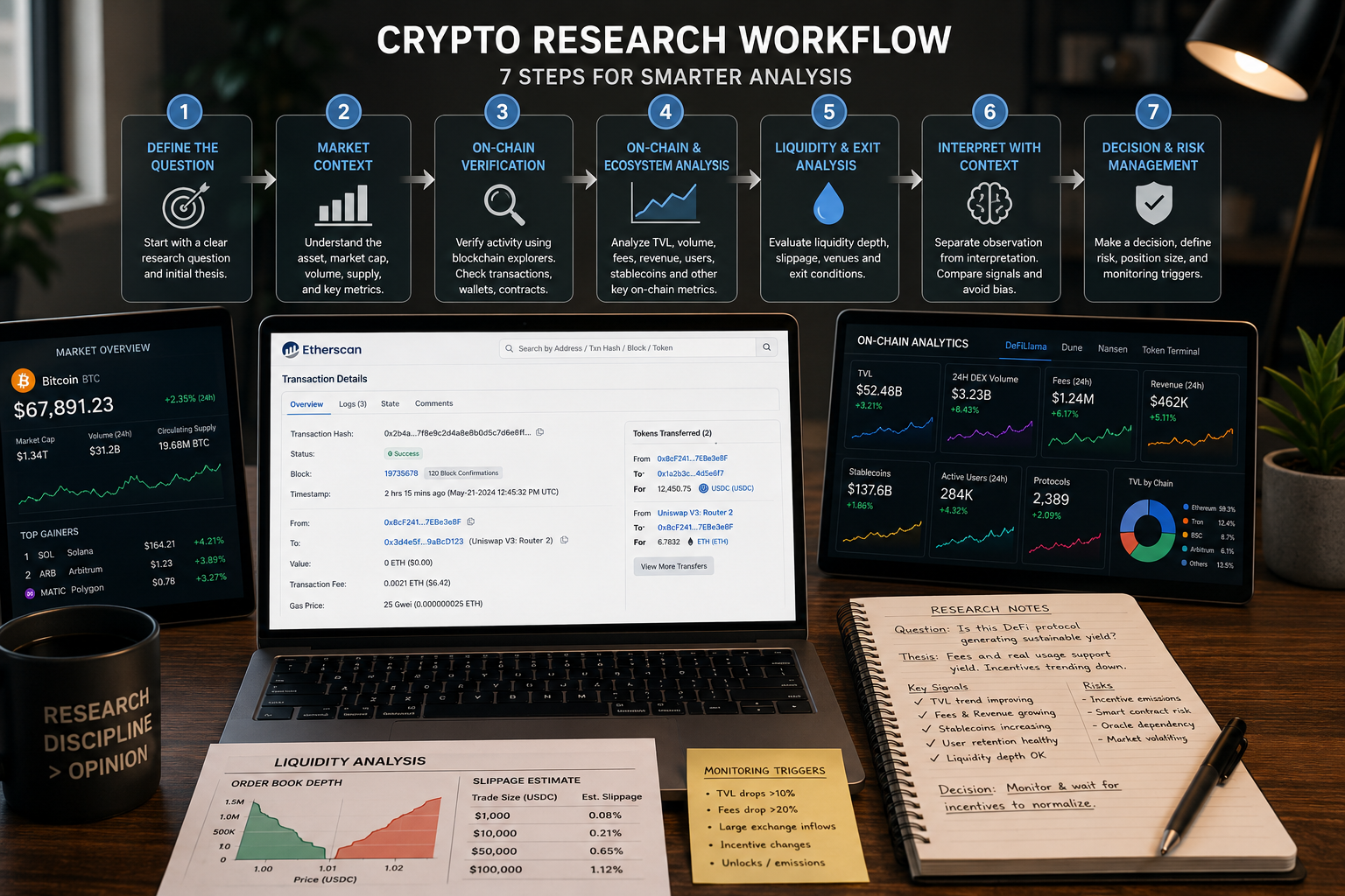
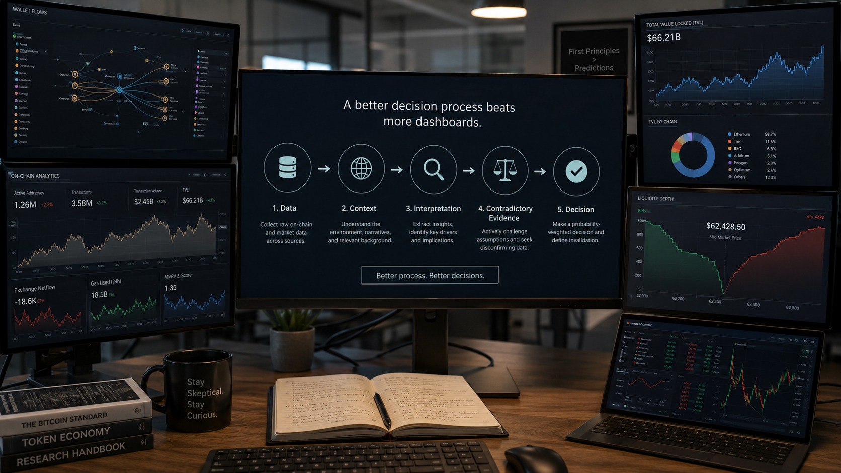
A disciplined workflow can be built around five stages.
1. Start With a Question
Define the decision or uncertainty before choosing the data source.
For example:
Is this protocol’s growth becoming more sustainable?
2. Choose the Minimum Necessary Evidence
Identify which metrics could answer that question.
The protocol example may require TVL quality, fees, revenue, user retention, liquidity depth, and incentive structure. It does not necessarily require every available whale alert.
3. Separate Observation From Interpretation
Write the raw finding first.
Then write the possible explanation.
This makes assumptions visible.
4. Search for Contradictory Evidence
Ask what data would weaken the thesis.
Do not only search for confirmation.
5. End With a Decision Rule
Define what the evidence changes.
The conclusion may be to invest, wait, reduce exposure, investigate further, or monitor a specific condition.
This framework makes tools subordinate to the research process.
That is where they are most valuable.
A Practical Checklist to Avoid Crypto Research Tools Mistakes
Before adding another dashboard, subscription, or alert system to your workflow, ask:
| Question | Why It Matters |
| What exact question will this tool answer? | Prevents random data collection. |
| Does the tool provide unique information? | Avoids unnecessary overlap. |
| Do I understand the metric definitions? | Reduces interpretation errors. |
| What alternative explanations exist? | Limits overconfidence. |
| Does another signal confirm the conclusion? | Encourages convergence. |
| Am I searching for evidence against my thesis? | Reduces confirmation bias. |
| Will an alert change a predefined decision? | Prevents reaction-driven monitoring. |
| Can I explain my conclusion without showing the dashboard? | Tests genuine understanding. |
| Does this information change position sizing or risk? | Connects research to action. |
The last two questions are particularly useful.
If an investor cannot explain why a metric matters without pointing at a chart, the interpretation may not be clear enough yet.
If the information does not change the decision, it may not deserve constant monitoring.
Common Signs That Your Research Stack Is Too Complex
A tool stack becomes counterproductive when the investor spends more time maintaining it than thinking.
Warning signs include:
- Checking the same metric on several platforms.
- Opening dashboards without a research question.
- Receiving alerts that rarely change decisions.
- Paying for subscriptions that are used only occasionally.
- Saving large numbers of screenshots without written conclusions.
- Changing metrics depending on the asset being researched.
- Following wallet labels without understanding the strategy.
- Feeling informed but being unable to explain the thesis clearly.
A good research system should reduce cognitive load.
It should make the reasoning easier to reconstruct later. The investor should be able to explain what was observed, how it was interpreted, what could invalidate the interpretation, and why the final decision followed.
Complexity is useful only when the problem requires it.
Final Thoughts
Better crypto research tools can improve access to information, reduce manual work, add wallet context, standardize metrics, and make complex blockchain activity easier to explore. Those benefits are real, but they do not remove the most difficult part of investing: deciding what information matters and what the evidence actually means.
The strongest research process begins with a question, not a dashboard. It uses the minimum set of relevant tools, separates observation from interpretation, compares independent signals, actively searches for contradictory evidence, and ends with a decision rule.
That approach is less visually impressive than running ten dashboards at once, but it is more difficult to manipulate with noise, emotion, and confirmation bias.
Better tools can help investors see more.
Better process helps them understand what they are seeing.
That is the real difference.