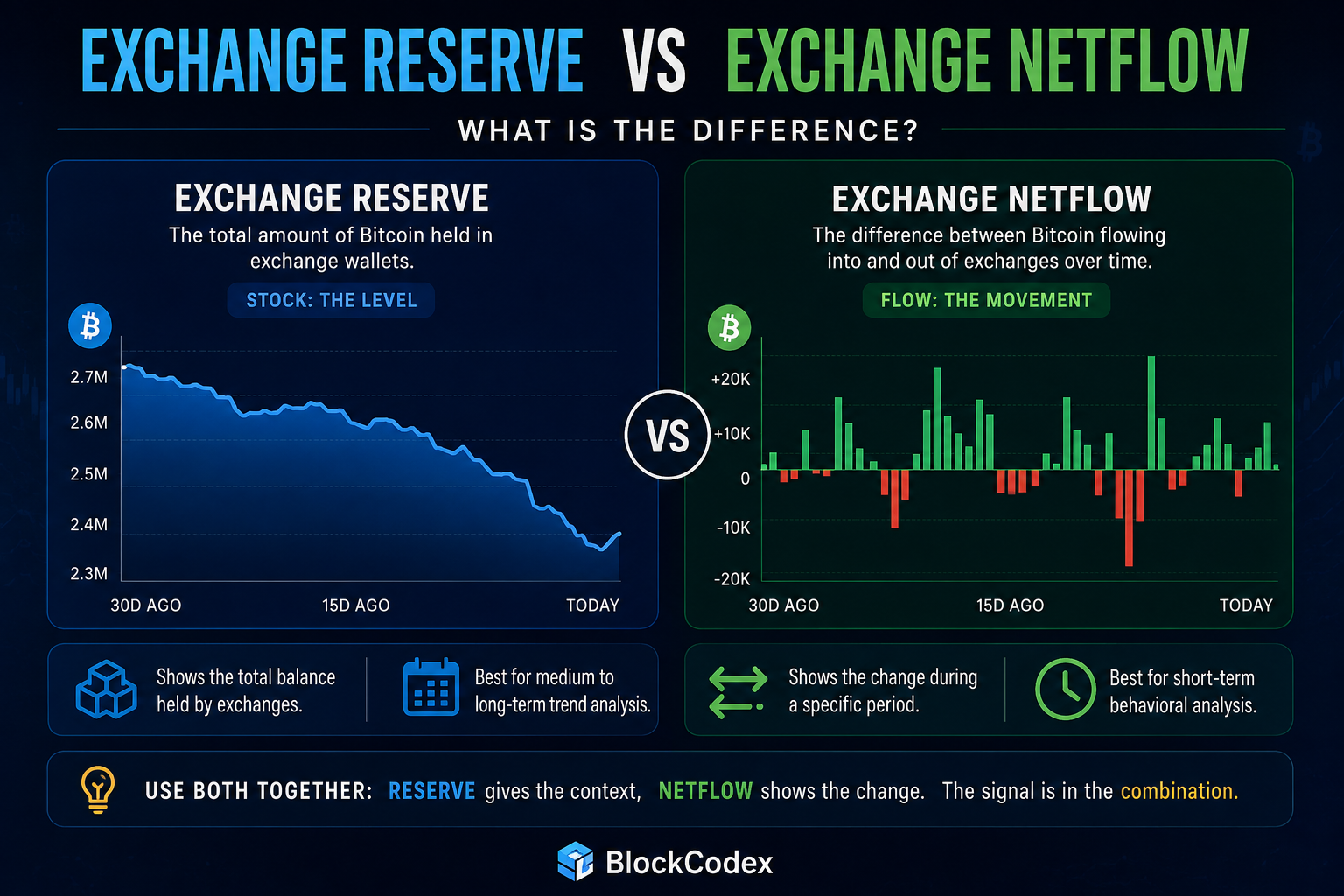
Learning how to read exchange netflow correctly starts with understanding what the metric cannot tell you. A large positive bar appears on CryptoQuant, Bitcoin is moving onto exchanges, and within minutes the interpretation becomes predictable: whales are depositing, selling pressure is coming, and price is about to fall.
Sometimes that interpretation turns out to be correct. The problem is assuming that the chart has already proved it. Knowing how to read exchange netflow means separating a change in exchange inventory from the market behavior that follows it.
Exchange netflow is useful because it compresses two opposing movements into one number. It shows whether more coins entered exchange-controlled wallets than left them during a given period. What it does not reveal is why those coins moved, whether they reached spot or derivatives venues, whether one exchange caused most of the change, or whether the market is actually struggling to absorb the additional supply.
That distinction is the difference between reading exchange netflow and simply reacting to it.
What Exchange Netflow Actually Measures
Exchange netflow is calculated by subtracting exchange outflows from exchange inflows.
A positive value means more coins entered exchanges than left during the selected period. A negative value means withdrawals exceeded deposits.
The calculation itself is straightforward, but its interpretation is not.
| Situation | Inflow | Outflow | Netflow | What You Actually Know |
|---|---|---|---|---|
| Deposits dominate | 8,000 BTC | 3,000 BTC | +5,000 BTC | Exchange-held supply increased |
| Withdrawals dominate | 4,000 BTC | 9,000 BTC | -5,000 BTC | Exchange-held supply decreased |
| Heavy movement both ways | 15,000 BTC | 14,500 BTC | +500 BTC | Activity was high, but the directional difference was small |
| Low activity | 1,500 BTC | 1,700 BTC | -200 BTC | Little net change occurred |
The third example is particularly important. A +500 BTC netflow produced by 15,000 BTC of deposits and 14,500 BTC of withdrawals describes a very different market from a +500 BTC netflow created by 600 BTC of deposits and only 100 BTC of withdrawals.
The final net number is identical, but the activity behind it is not.
Exchange netflow should therefore be treated as a balance-of-flows metric, not as a complete description of what is happening on exchanges.
Start With the Exchange Type, Not the Color of the Bar
Before interpreting a CryptoQuant netflow chart, check where the movement occurred.
CryptoQuant separates exchange activity into aggregated exchange data as well as spot and derivatives exchange categories. That distinction can completely change the meaning of the signal.
For spot exchanges, positive BTC netflow means more Bitcoin has become available inside venues where it could potentially be sold. Sustained deposits can therefore increase potential sell-side inventory, while persistent withdrawals remove coins from immediate spot-exchange availability.
Derivative exchanges are different.
Bitcoin deposited on a derivatives venue may be used as collateral for leveraged positions, hedging strategies or basis trades. It can support both longs and shorts, so an increase in derivatives exchange flows is often more useful as a signal of changing leverage or potential volatility than as a simple bearish prediction.
Before asking whether a netflow spike is bullish or bearish, ask a more basic question:
Which market actually received the coins?
That single check can prevent a large share of incorrect interpretations.
Build a Baseline Before Judging a Netflow Spike
For a first CryptoQuant review, simplicity is usually better than combining several indicators at once.
Start with Bitcoin exchange netflow, isolate spot exchanges and examine a daily chart over approximately the previous month. The objective is not to find a universal threshold for dangerous inflows. It is to understand what has been normal recently.
Suppose daily netflow has remained relatively close to zero for several weeks and one session suddenly produces an unusually large positive reading. That deserves investigation.
Now imagine that similarly large positive and negative bars have appeared throughout the month. The latest spike may still matter, but it is no longer exceptional relative to the recent operating range.
Absolute numbers are surprisingly easy to exaggerate when they are viewed without a baseline.
A 2,000 BTC inflow can look enormous in isolation. If similar flows have appeared several times recently without meaningful market impact, the number requires a much more cautious interpretation.
Positive Netflow Is Potential Supply, Not Confirmed Selling
The cleanest interpretation of positive BTC spot netflow is simple:
More Bitcoin became available inside exchange infrastructure than was removed from it.
That is already useful information. Going from that observation to “holders are selling” requires additional evidence.
A holder can transfer BTC to an exchange and leave it there. A market maker can reposition inventory. A fund can reorganize custody. Assets may move for collateral, operational or exchange-service purposes rather than because the owner intends to sell immediately.
The blockchain records the movement.
It does not automatically reveal the motivation.
This is why the broader BlockCodex guide to exchange inflow in crypto treats exchange deposits as potential supply rather than completed selling.
Netflow analysis should take the next step. Once exchange-held supply changes, the investor needs to determine whether the market behaves as though that change actually matters.
Read the Price Reaction Before Creating a Narrative
Imagine that CryptoQuant shows a meaningful positive spot netflow.
There are several ways the market can respond.
Bitcoin may remain stable or continue rising despite the additional exchange supply. Spot activity remains healthy, buyers repeatedly absorb available offers, and price refuses to break lower. In that case, the inflow was real, but the market demonstrated enough demand to absorb it.
That is valuable information.
In another scenario, positive netflow increases while price begins losing support, nearby bids weaken and execution conditions deteriorate. Exchange supply and market behavior are now pointing in the same direction.
That is much stronger evidence of actual selling pressure.
A useful principle is:
A flow becomes more informative when price reacts in the way the flow hypothesis predicts.
If positive netflow supposedly represents strong selling pressure but price continues absorbing the supply, the answer is not to insist that the bearish signal must eventually be correct. The ability of buyers to absorb the additional inventory is itself part of the signal.
This is exactly why on-chain metrics need market context. Blockchain data becomes considerably more useful when it is compared with price behavior, liquidity and the surrounding market structure.
Liquidity Determines Whether the Flow Can Actually Move the Market
A netflow number does not have the same impact under every market condition.
Five thousand BTC arriving on exchanges during a highly liquid session is not equivalent to the same amount arriving during a thin weekend market or an aggressive sell-off.
The more useful question is:
How large is the potential supply relative to the market’s ability to absorb it?
You do not need a perfect institutional model to answer this. Look at whether spreads remain stable, whether meaningful order-book depth exists near the current price, whether spot volume supports execution and whether price impact increases significantly as trade size grows.
Combining those observations produces a much more useful framework.
| Netflow | Price Reaction | Liquidity | More Useful Interpretation |
|---|---|---|---|
| Positive | Falling | Weakening | Selling-pressure hypothesis strengthens |
| Positive | Stable or rising | Strong | Additional supply may be getting absorbed |
| Negative | Rising | Healthy | Withdrawal or accumulation thesis gains support |
| Negative | Falling | Weak | Lower exchange supply is not enough to create demand |
| Near zero | Highly volatile | Thin | Leverage or market structure may be driving the move |
Exchange netflow should therefore not be converted into a trading system by itself. It measures one part of the supply environment, while price still depends on how buyers and sellers interact with that supply.
The Same Positive Netflow Can Describe Very Different Markets
A positive bar looks simple on a chart, but at least three different mechanisms can sit behind it.
The first is genuine spot distribution. Holders move BTC toward spot exchanges, those coins become available for sale, buyers fail to absorb the additional supply and price weakens. This is the classic bearish interpretation, and it is the situation in which positive netflow behaves most intuitively.
The second is collateral or trading activity. If the movement is concentrated on derivatives exchanges, traders may be increasing margin for leveraged positions rather than preparing to sell BTC on the spot market. The resulting signal may tell investors more about future volatility than direction.
The third is operational movement. Exchanges manage large networks of hot wallets, cold wallets and operational addresses. Transfers associated with reserve restructuring or wallet management can create substantial blockchain movements without representing a new directional decision from investors.
This is why the headline “Bitcoin is flowing to exchanges” is incomplete.
A stronger analysis asks:
- Which exchanges received the assets?
- Were they spot or derivatives venues?
- Was the movement unusual relative to recent history?
- Was it broad or concentrated?
- How did price respond?
- Could the market absorb the potential supply?
The netflow number begins the investigation. It should not end it.
Check Inflow and Outflow Separately When Netflow Looks Strange
One weakness of netflow is that compression can hide important information.
Suppose daily netflow is close to zero. That might mean almost nothing moved in either direction. It could also mean enormous deposits and withdrawals nearly cancelled each other out.
Those situations are not equivalent.
When a netflow reading looks unusually small, unusually large or inconsistent with price behavior, open the inflow and outflow metrics separately.
This can reveal whether the move came from a genuine directional imbalance or simply from heavy two-way activity.
You can then go one step further by examining whether the inflows were driven by a small number of larger deposits or by a broader group of participants.
This distinction is particularly useful during periods of market stress. A large aggregate inflow caused by a handful of transactions deserves a different interpretation from widespread deposits across many participants.
Netflow gives you the balance.
The underlying flow metrics show how that balance was created.
Do Not Apply the Bitcoin Rule to Stablecoins
Another common mistake is applying the BTC interpretation directly to stablecoins.
When Bitcoin moves onto spot exchanges, additional BTC becomes available for potential selling. When stablecoins move onto exchanges, the opposite interpretation may be more relevant: traders may be moving purchasing power closer to the market.
A positive stablecoin netflow can therefore reflect potential buying liquidity rather than sell-side pressure.
The same contextual rule still applies.
Stablecoins deposited onto derivatives venues can be used as collateral for leveraged positions. They may support longs, shorts or hedging activity rather than immediate spot purchases.
This means there is no universal rule such as:
Positive netflow = bearish.
The asset and destination both matter.
Remember That Exchange Labels Are Estimates
There is another limitation that is rarely discussed when investors use exchange-flow dashboards.
The blockchain itself records addresses and transactions. It does not label an address as “Binance,” “Coinbase” or “Kraken.”
Analytics providers build those labels by identifying and clustering addresses believed to belong to specific entities. As new addresses are discovered or previous classifications are refined, exchange-flow datasets can be updated.
That means historical flow numbers can sometimes change even though the underlying blockchain transactions obviously did not.
The transaction history remains immutable.
The provider’s understanding of who controlled the addresses improved.
This does not make exchange-flow analytics unreliable. It simply means that investors should avoid treating one extremely precise historical netflow number as unquestionable ground truth.
Exchange-flow data is best used as structured evidence inside a broader analysis.
How to Read Exchange Netflow on CryptoQuant in Five Minutes
A practical netflow review does not need to become complicated.
Begin with Bitcoin spot exchange netflow and compare the latest reading with the previous several weeks. Determine whether the movement is genuinely unusual before reacting to it.
Then check whether the change is broad or concentrated on one venue. A market-wide pattern generally carries different implications from an isolated exchange event.
Next, inspect inflow and outflow separately. This shows whether the netflow resulted from a strong directional imbalance or from heavy two-way movement.
After that, leave the on-chain dashboard.
Look at price behavior, spot participation and market depth. If additional exchange supply appears while price weakens and liquidity deteriorates, several independent pieces of evidence are reinforcing the same interpretation.
If the signals contradict one another, do not hide the contradiction.
It may be the most useful information in the entire analysis.
What Makes an Exchange Netflow Signal Stronger?
Once you understand how to read exchange netflow in context, the size of the bar becomes less important than the conditions surrounding it. An unusually large move relative to recent history is more meaningful than a normal daily fluctuation.
Exchange netflow deserves more attention when several conditions appear together.
An unusually large move relative to recent history is more meaningful than a normal daily fluctuation. Persistent flows across several observations carry more weight than one isolated spike. Activity concentrated on spot exchanges is more directly relevant to potential sell-side supply than collateral movements into derivatives venues.
The signal becomes stronger again when market behavior confirms it.
For example, repeated positive spot netflows combined with weakening market depth, deteriorating price structure and evidence of broader distribution create a much stronger case than one positive CryptoQuant bar.
The same principle works in the opposite direction. Persistent exchange withdrawals accompanied by healthy demand and improving price structure can strengthen an accumulation thesis, particularly when the pattern fits the broader phase of the crypto market cycle.
No individual condition guarantees a price move.
The value comes from convergence.
When Exchange Netflow Should Be Ignored
Not every netflow movement deserves investigation.
Small fluctuations within the normal recent range are often noise. An isolated spike that produces no meaningful reaction and quickly reverses may have little analytical value. The same applies when the movement is clearly associated with internal exchange operations or when the exchange classification is uncertain.
Netflow is also less useful when another mechanism clearly dominates the market.
During a major liquidation cascade, for example, derivatives positioning and market depth may explain immediate price behavior much better than spot exchange inventory. During a major macro event, external information can temporarily overwhelm normal on-chain patterns.
Good analysis is not about forcing every available metric into the thesis.
It is about knowing when a metric is relevant enough to deserve weight.
Final Thoughts
Exchange netflow is one of the cleaner ways to monitor how Bitcoin inventory changes across exchanges because it forces inflows and outflows into the same calculation.
That simplicity is useful, but it can also create false confidence.
Positive BTC spot netflow tells investors that more coins entered exchange-controlled wallets than left during the selected period. Negative netflow tells them that withdrawals exceeded deposits. Neither observation automatically reveals what the owners intend to do next.
The stronger process starts with the flow, identifies the venue, compares the move with its recent baseline and then examines how the market responds. Price behavior, spot participation and liquidity determine whether the additional exchange inventory actually matters.
If those layers converge, netflow becomes a meaningful part of the thesis. If they conflict, the contradiction should remain visible rather than being forced into a bullish or bearish narrative.
The goal is not to predict price from one CryptoQuant bar.
It is to understand when a change in exchange inventory is important enough for the rest of the market to notice.