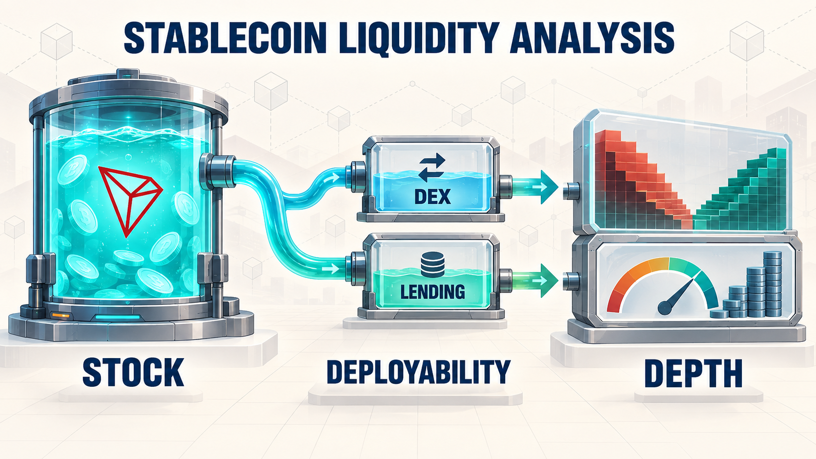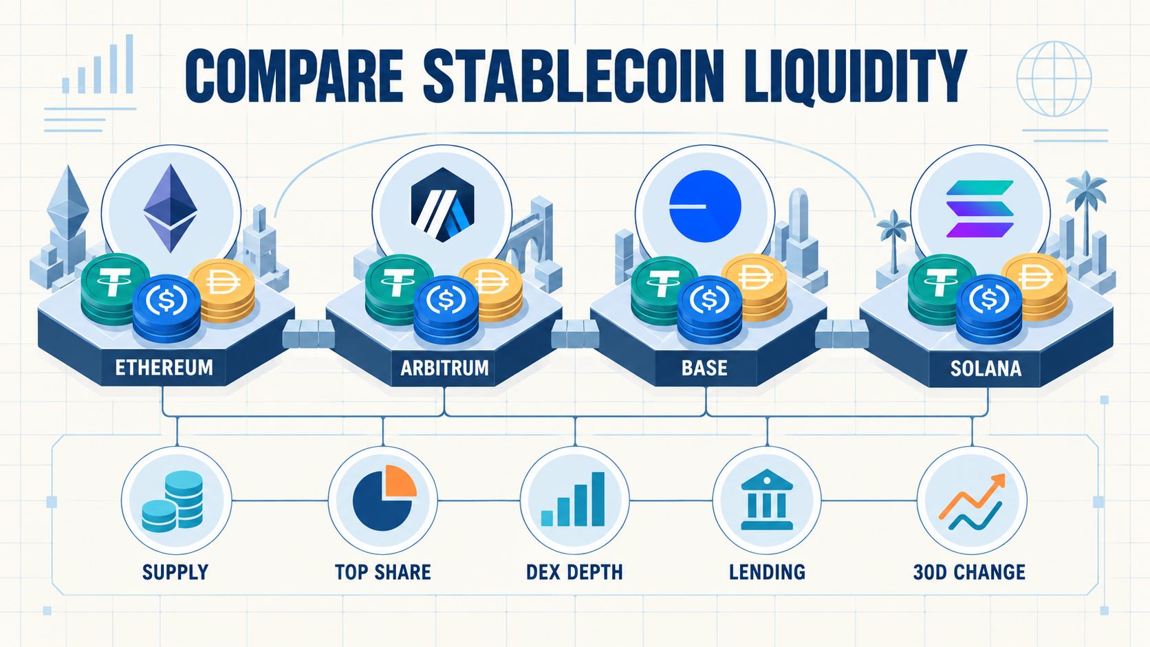
Compare stablecoin liquidity across blockchains by measuring more than the number shown beside “stablecoin market cap.” Supply establishes how much dollar-like value exists on a network, but it does not show whether that value can be traded, borrowed or moved without friction.
A useful comparison needs five layers: total stablecoin supply, the share controlled by the leading stablecoin, DEX liquidity, lending availability and the change in supply over a fixed period. Every chain must be measured from the same source and as close as possible to the same timestamp.
This guide applies that method to Ethereum, Arbitrum, Base and Solana. The result is not a league table. It is a worked example showing why different definitions can produce different answers to the question, “Which ecosystem has stronger stablecoin liquidity?”
Compare Stablecoin Liquidity Across Blockchains With Five Metrics
Start by defining each column before collecting data. Changing the definition after seeing the results turns a comparison into a narrative.
| Metric | What It Measures | Main Limitation |
|---|---|---|
| Total stablecoin supply | USD value of tracked stablecoins circulating on the chain | Capital may be idle, concentrated or unavailable to DeFi |
| Top stablecoin share | Leading stablecoin supply divided by total chain supply | Concentration does not prove that the leading asset is unsafe |
| DEX liquidity proxy | TVL assigned to protocols classified as DEXs | Includes non-stable assets and cannot replace a live slippage quote |
| Lending availability | Number and TVL of lending markets above a material threshold | Protocol TVL does not show the liquidity of every stablecoin market |
| 30-day net change | Current supply minus the prior-month observation | A positive change can be temporary or concentrated in one asset |
These metrics separate scale, diversity, deployment and direction. That is the foundation of a repeatable DeFi liquidity comparison.
Use One Source and One Observation Window
The worked example uses DeFiLlama’s stablecoins-by-chain data and its protocol classifications. The API observations were retrieved on September 3, 2026 at approximately 08:05 UTC.
Stablecoin supply, the prior-month observation and each asset’s chain balance came from the same stablecoin dataset. DEX and lending TVL came from the same protocol dataset. The calls were made within minutes of one another, although separate endpoints can refresh at slightly different times.
Four formulas make the table reproducible:
- Total supply = sum of the USD-valued current balances of tracked USD-pegged stablecoins on the chain.
- Top share = leading stablecoin balance ÷ total stablecoin supply × 100.
- 30-day change = current total supply − total supply in the prior-month fields.
- DEX liquidity proxy = sum of chain TVL for protocols classified as “Dexs.”
For lending availability, the table counts only protocols with at least $10 million in chain-level lending TVL. The threshold removes inactive and very small deployments that can inflate protocol counts without adding meaningful borrowing capacity.
A Cross-Chain Stablecoin Liquidity Snapshot
| Chain | Stablecoin Supply | Leading Stablecoin Share | DEX TVL Proxy | Lending Markets ≥ $10M | 30-Day Supply Change |
|---|---|---|---|---|---|
| Ethereum | $148.82B | USDT: 49.5% | $4.06B | 22 markets / $29.38B TVL | +$812.9M (+0.55%) |
| Arbitrum | $3.77B | USDC: 58.3% | $268.7M | 5 markets / $743.6M TVL | +$138.4M (+3.81%) |
| Base | $4.88B | USDC: 86.0% | $768.3M | 7 markets / $4.54B TVL | +$103.9M (+2.17%) |
| Solana | $15.99B | USDC: 41.9% | $2.27B | 6 markets / $2.61B TVL | −$202.2M (−1.25%) |
Source: BlockCodex calculations from the public DeFiLlama stablecoin dataset and protocol dataset. Values are rounded. Aggregator coverage and historical values can be revised.
What the Table Actually Shows
Ethereum has the largest stablecoin stock in this sample and the broadest lending layer. Its leading asset accounts for roughly half of tracked supply, so it is less concentrated than Base or Arbitrum by this specific measure.
Solana has the second-largest stablecoin supply and DEX TVL proxy, while its leading stablecoin share is the lowest of the four. However, its 30-day supply change is negative. That combination describes a large and comparatively diversified base whose recent direction weakened during the observation window.
Base shows why total supply cannot stand alone. Its supply is much smaller than Solana’s, yet its lending TVL is larger in this snapshot. At the same time, 86% of its tracked supply is USDC, creating more asset concentration than the other chains in the sample.
Arbitrum records the fastest percentage growth, but from the smallest starting supply. Its DEX and lending layers also remain narrower than those of the other sampled networks. Percentage growth therefore needs to be read beside absolute scale and available venues.
None of these observations proves that one chain is universally “best.” A trader, borrower, payment company and stablecoin issuer may value different forms of liquidity.
Why Stablecoin Supply Is Not Enough
A chain can hold billions of dollars in stablecoins while offering poor execution for the pair and order size an investor actually needs. Capital may sit in treasury wallets, bridges, centralized-exchange addresses or protocols that cannot support a specific trade.
The broader BlockCodex guide to stablecoin liquidity in a crypto ecosystem explains this distinction between available supply and usable market depth. Supply is the first screen, not the final answer.
DEX TVL is also only a proxy. It includes volatile assets, concentrated positions outside the current price range and pools unrelated to the desired stablecoin route. The practical follow-up is to request same-time quotes for standard trade sizes, such as $10,000, $100,000 and $1 million, and record expected output, price impact, fees and route fragmentation.
How to Run the Comparison Yourself
- Fix the universe. Choose chains that serve the same research question. Do not compare a payments network with a DeFi chain without explaining the different use cases.
- Freeze the timestamp. Export every dataset in one session and record the UTC time.
- Normalize the assets. Decide whether the analysis includes only USD-pegged stablecoins and how depegged or bridged assets are valued.
- Calculate concentration. Measure the leading asset’s share rather than assuming a large supply is diversified.
- Map deployment. Add DEX and lending data using one category definition and a disclosed materiality threshold.
- Test execution. Quote identical trade sizes and pairs on every chain, then compare slippage and route quality.
- Repeat after 30 days. Separate temporary inflows from a durable increase in usable liquidity.
The tools used for each layer also matter. BlockCodex’s comparison of crypto research tools for ecosystems shows where chain, protocol, wallet and market data complement one another.
Common Cross-Chain Comparison Errors
- Mixing a current supply figure from one provider with last week’s DEX figure from another.
- Calling stablecoin supply “liquidity” without checking where the assets can be used.
- Comparing percentage growth without showing the starting value.
- Treating all bridged versions of a stablecoin as equivalent.
- Using DEX volume as a substitute for depth or assuming TVL guarantees low slippage.
- Counting every deployed lending protocol even when most have negligible deposits.
These errors also affect broader ecosystem analysis. The BlockCodex framework for judging whether a blockchain ecosystem is growing combines liquidity with users, fees, retention and application diversity rather than relying on one chart.
Final Comparison Framework
To compare stablecoin liquidity across blockchains consistently, begin with supply, then test concentration, deployment and direction. Use DEX TVL and lending TVL as screening indicators, not as guarantees of executable liquidity.
The strongest result is convergence: a growing stablecoin base, several important assets, deep exchange routes, multiple lending venues and durable improvement across repeated observations. If only the headline supply looks strong, the comparison is incomplete.
Frequently Asked Questions
What is the best metric for comparing stablecoin liquidity across chains?
No single metric is sufficient. Total supply is the best starting point, but concentration, trade execution, DEX liquidity, lending markets and recent supply change determine whether that capital is usable.
Does higher stablecoin supply mean lower slippage?
No. Supply can sit outside DEX pools or be fragmented across assets and venues. Lower slippage must be verified with comparable live quotes for the same pair and order size.
Why measure the leading stablecoin’s market share?
It reveals concentration. A chain that depends heavily on one stablecoin may have efficient liquidity, but it also has greater exposure to that asset’s issuer, bridge, integrations and market availability.
How often should the table be updated?
A quarterly refresh is suitable for structural comparison. Recheck sooner if supply moves by more than 10%, the leading stablecoin changes, a major lending or DEX deployment launches, or the data provider changes its methodology.